Tire Rack is a customer-direct tire, wheels, car accessories distributor headquartered in South Bend, Indiana. They are the second largest online tire retailer in North America.
The Challenge
This was the first job of my professional career after graduating from college. I was brought on as a web designer to join the company’s growing marketing team. General responsibilities included building and producing web projects, online advertising, and email marketing.
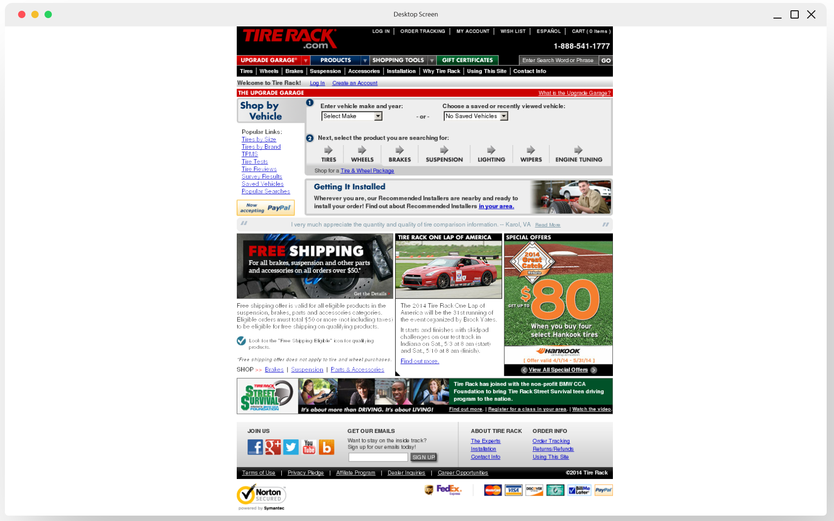
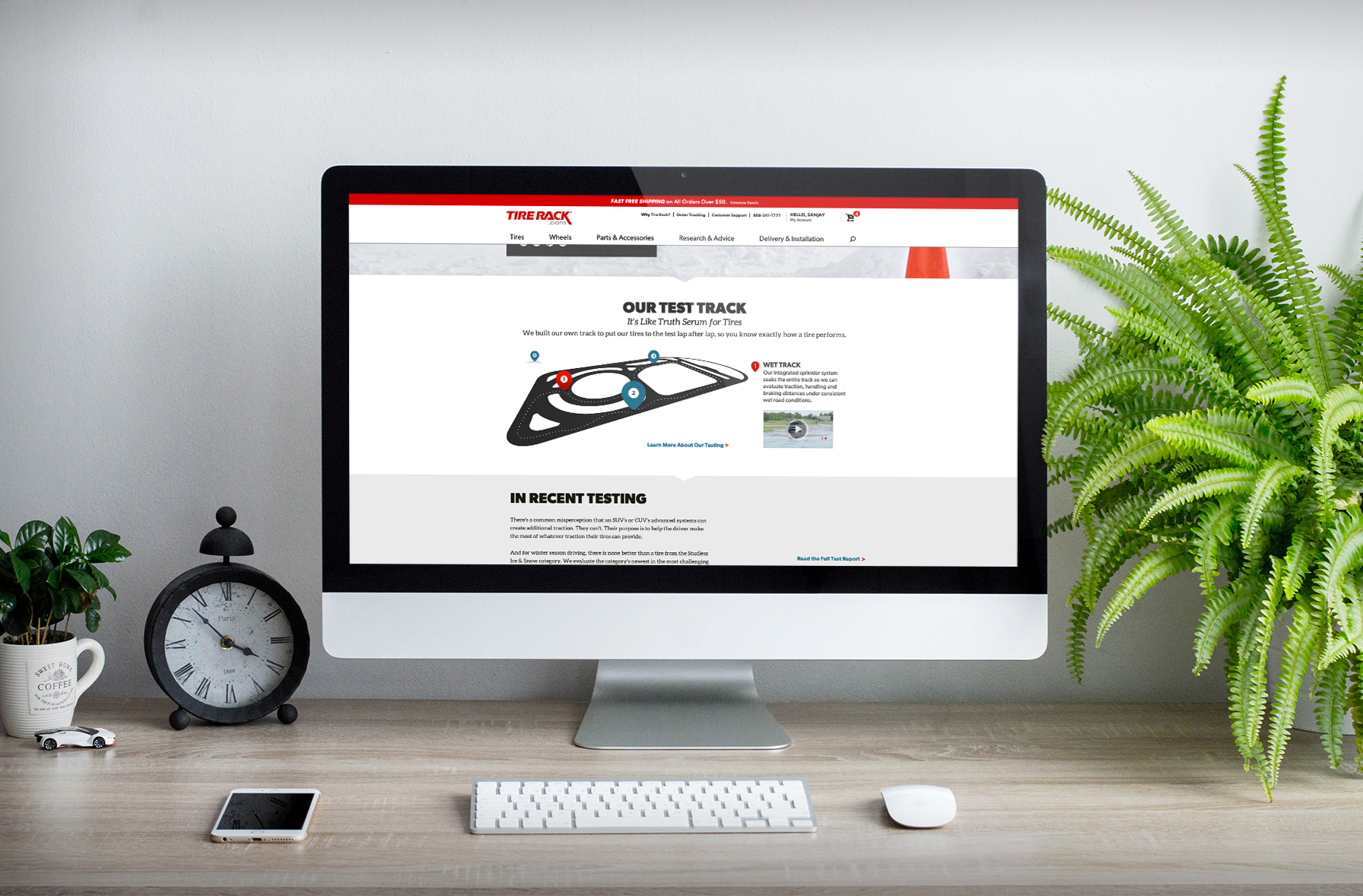
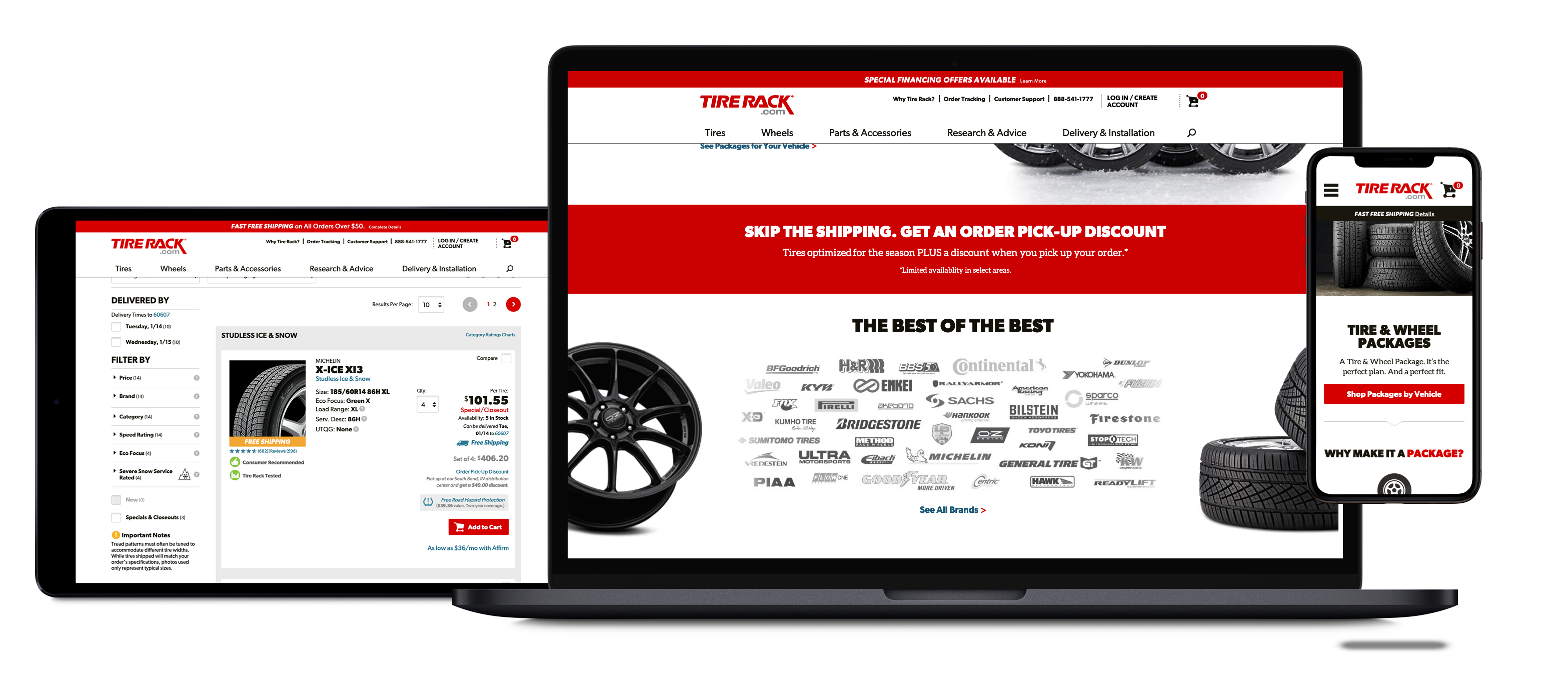
In 2012, the current version of the retail website was very dated. Built initially in the early 2000s, the website needed a total refresh. The current site did not adhere to growing standards at the time such as responsive web design, HTML5, CSS3 and more. There was a need for flat design versus the very dated skeuomorphism aesthetic.
The overall challenge of the design team was to present and build a new retail website that would fall in line with modern trends, and increase overall online traffic.
Users & Audience
The target users of the Tire Rack retail website were patrons who ordered their tires online. Tire rack has a large car enthusiast audience, so the site needed to appeal to uneducated tire buyers as well as the highly informed automobile enthusiasts. The current site had the process of tire buying simplified, but the overall experience was subpar.
Team & Role
I joined a team of six web designers. Tasks for sections of the website were distributed by the lead. All planning and prototyping were done by the company's UI/UX Designer. The project was then handed off to our team for mockups and front-end development.
Design Process
In order to understand the ux flow of the website, we had to work with the UX Designer to design mockups.
The style guide for the website was developed and finalized after narrowing down from three options that were presented. Based on that style guide we were able to quickly design a UI that was consistent with the aesthetic.
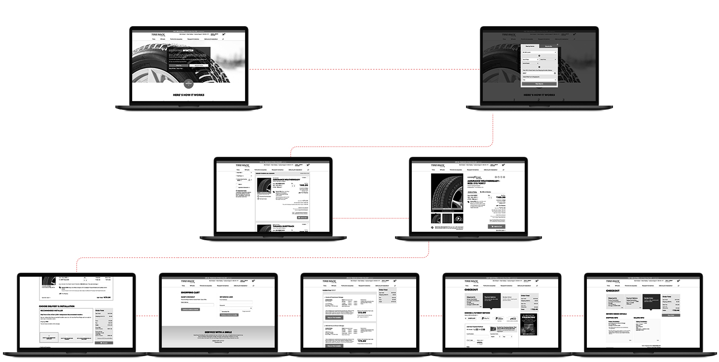
With the mapped-out user flow with all entry points, we complimented it with the missing steps that the old site did not have. It is essential for understanding each design decision in the context and taking every special case into consideration.
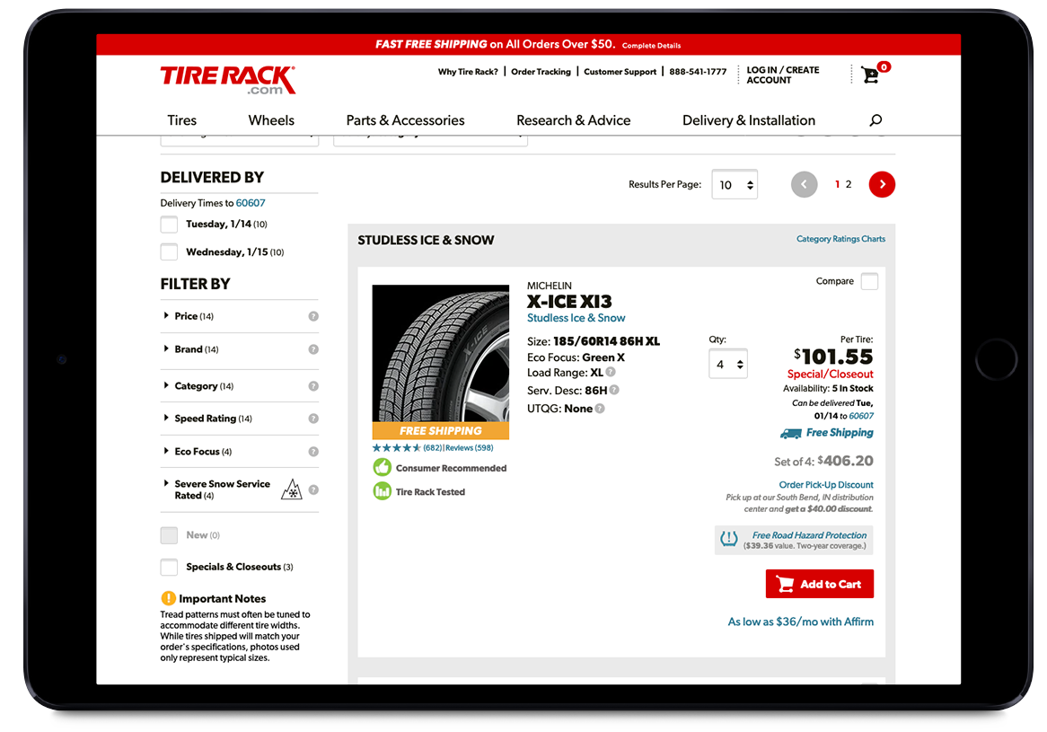
User Interface Design
The objective of the interface was to keep the site familiar, but present a modern solution to end users. This was accomplished through the use of the red primary color, the use of very subtle secondary and tertiary colors, rounded corners, flat design, vibrant beautiful imagery, and practical icons.
Front-End Development
As mockups completed, our team would develop and translate the designs into a usable front-end, using HTML5, CSS3, and JavaScript. The front-end would then be handed off to developers for further programming and back-end integration.
Outcome
Since the 2014 launch, the site has grown and has been able to establish further brand recognition. The analytics proved that overall site traffic and sales did increase as a result of the new site launch.